Recently, I participated in the design of a management software for a Canadian company specialized in road transportation.
Since the deployment is spread over several years and several areas of the company, I have chosen to focus only on a specific but central part of the application and of the company in this small case study: the truck dispatch center.
Setting the context
The mission I did for this company was in fact the first project I was given to work on when I first arrived at SIA Innovations. When I was hired, SIA was already about to start the second phase of the software development. Since the project was already well underway, I had to rethink my usual way of working and adapt to the process that was in place, while still focusing on the importance of listening to the end users and including them in the design cycle.
A few words about the company…
This Canadian company specializes in road transport and logistics, more specifically in the delivery and installation of furniture and appliances. The company has numerous warehouses across Canada and an even greater number of trucks.
Currently, it is in the process of completely overhauling its entire internal operations, based on the development of an internal ERP software.
Having relied on Excel and paper files up until now, the introduction of the software, and the changes required to use it, represents a major challenge for the company. And it is not the only company in this boat.
The problem
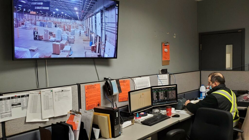
Dispatching is at the center of this company, as it acts as a sort of command center. It is the dispatch center that plans the routes and the loading of the trucks. For this reason, this room, which we find in each of the warehouses, must have a clear view on what is in the warehouse as well as on the position of each truck that comes in or leaves the warehouse.
How can we enable this place on which everything depends to function most effectively at all hours of the day and night?


I. Understanding the current situation
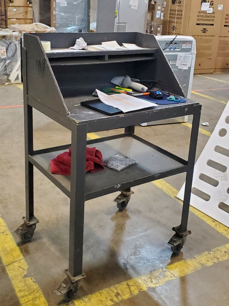
When I started working on the project, I quickly realized that the company possessed a large amount of information and processes. However, the data that was useful to me was scattered around and of variable quality.
The first step for me was to identify the different stakeholders and their involvement in the project. I then conducted interviews with the project manager and the technical manager from SIA Innovations. Finally, I conducted individual remote interviews with the client’s stakeholders.

II. Design the processes and the first models
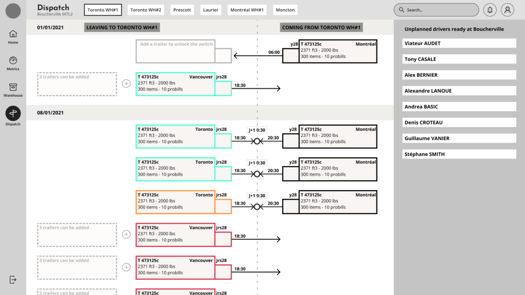
In order to understand how the dispatchers work, I designed with them flows representing the “as is” or current process, the tasks to be completed, and the user path. Then, I realized the “to be” process, or future process, by checking it in real time and eliminating the useless tasks as well as those that could be automated. After identifying the new processes, I performed a “crazy 8” exercise to find ideas. This was followed by the transposition of the idea into a low-fidelity Figma prototype; this allowed me to quickly obtain the client’s validation and to test the prototype with the employees.

III. Imagine a new graphic identity
The company had a graphic identity limited to its logo and a palette of 3 colors: orange, white, and black. In order to develop it further, I took a look at the history of the company and the world of transportation, and proposed a graphic identity derived from their logo.
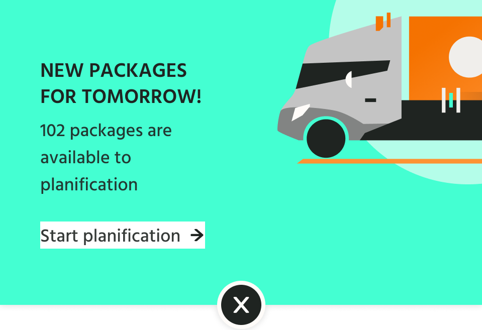
This new universe is based on the symbolism of movement and itineraries, but I also used the foundation date of the company as an inspiration, especially in relation to the color scheme.
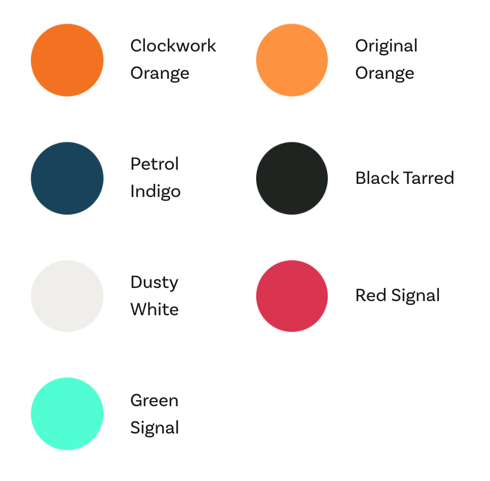
The color palette is freely inspired by the world of the 70’s, decade of the company’s creation.

IV. Creating high fidelity screens
Once the graphic universe was defined and the low-fidelity models were tested and approved, I was able to create the high-fidelity screens relatively quickly, while taking care to prepare the ground for the developers.

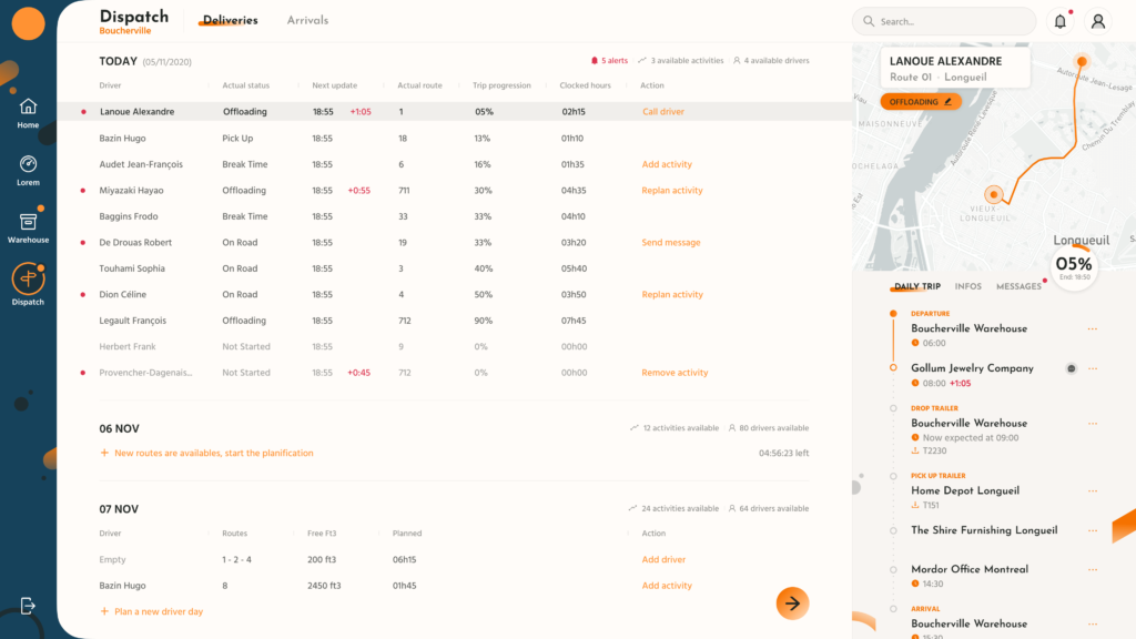
Using Figma from the start of the mission was very helpful. Throughout the process, I was able to design components for the basic feature set; these pieces could be used very quickly by the developers in building the screens.
It is important to mention that, although the application was designed to be used primarily on a computer, I had chosen from the start to make it possible to use it on a tablet.
Conclusion
Transforming processes that were previously done through Excel files, paper documents, and email exchanges into a complete application is only the first step. This metamorphosis has to take place in iterations. Indeed, interactions allow the company and the individuals within it to absorb the changes brought about by the deployment of a complete management solution at a tenable pace.
Teaching, listening, training teams, and evaluating use are major success criteria for the project to avoid a change that is too sudden and important and therefore likely to destabilize the teams.
This is, I think, the best way for this company to successfully make the switch to a fully and efficiently automated process without leaving some of its employees behind.


